
A friend of mine recently sparked a really interesting discussion regarding quality of painted miniatures and models which was really interesting and tapped into all my art-wank thinky bits. The discussion centred around the Golden Demon winners from this year’s (2022) competition. Specifically, the Gold and Silver placed models in one specific category. Both stunning pieces, but it sparked some interesting debate about whether or not the winner was deserving when the second place was at first glance the ‘better’ figure. Obviously this is all very subjective and everyone will have an opinion here, but I would assume that a competition of the calibre of Golden Demon would have pretty strict judging guidelines that go beyond just one’s opinion.
I scrutinized both models myself as objectively as possible, trying to find areas of the winning model that were superior, not really to ‘justify’ its 1st place, but more to understand. Both models are absolutely stunning – truly excellent paintjobs (again, an opinion) with near flawless execution, each brush stroke immaculate.
This got me thinking. What defines a great paint job? When you have miniature painters competing at the highest level, each a master of the craft, what separates the great from the really good? Is there more than just paint?
So I thought I’d wax lyrical for a bit and see what else there is beyond just paint and brush.
Big ‘ole disclaimer
Before I get into all this nonsense, a few things. This is all just my opinion – we’ve all got one and they’re often different. And that’s absolutely a good thing. My intention is not to convince you or anyone else that they’re wrong. I’m just hoping to tease out some of the subtle but important aspects of miniature painting that often go overlooked.
Further, I’m no real authority on these things. I’ve never judged any competitions or anything of the sort; I’m just your average painter with a little bit of formal art + design education and a blog where I can spout my words to the world. Please don’t take anything here as gospel.
The models

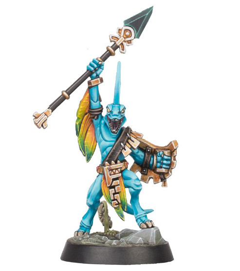
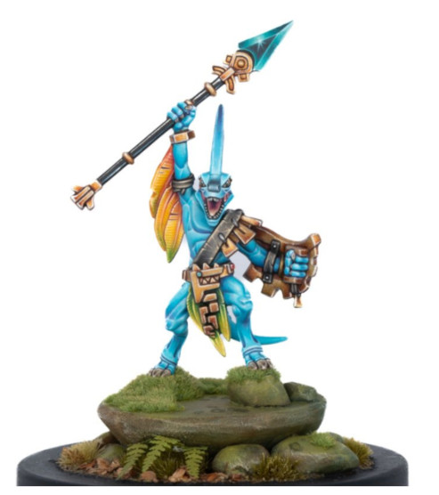
First, the “Gold”, first place winner – Gavin Garza’s take on the Skink champion Huachi. This is a truly amazing rendition of what is quite a simple figure. But the bright, vibrant colours, excellent basing, framing of the figure creating a strong focal point all elevate this lil’ fella beyond just any old rank and file skink.
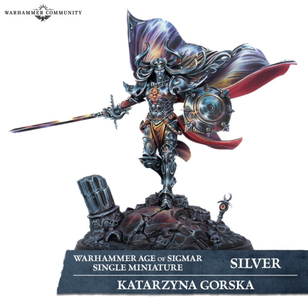
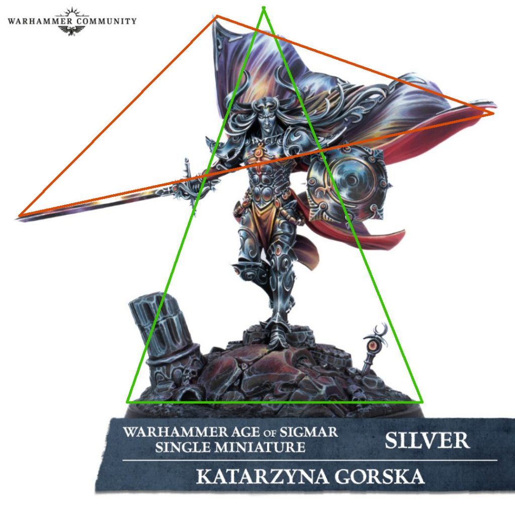
The “Silver” – second place model – Prince Sigvald The Magnificent, by Katarzyna Gorska. Now, this is just jaw dropping. An amazing concept executed perfectly with powerful non-metallic metal effects create a dreamy, ethereal appearance befitting of a Prince of Slaanesh.
There’s no doubt that both figures are stunning. The technical aspects – blending, glazing, details etc are all immaculate on both models. So what differentiates one from the other? What makes one ‘better’? Let’s go beyond the paint for minute.
Exploring composition
In art theory, composition is a term used to describe the way in which different elements of an artwork are combined. In general, this refers to the key subjects of the artwork and how they are arranged in relation to each other. Composition is important; it contributes a lot to whether a piece of art is pleasing to the viewer. It brings a degree of structure to the overall image and helps to focus the viewer’s eye on key areas. Yet, it can also create a sense of movement and dynamism; a strong composition can create a visual path that leads the viewer’s eye through the work.
There are many aspects that contribute to a strong composition. For example, strong lines and shapes – either explicit or implicit can allow the artist to direct the eyes of the viewer. When considered in the context of miniature painting, the composition of the overall piece is to a large degree informed by the sculpt of the figure itself, less about the nature of the paint. The position of the figures body, arms, the pose it is in, any weapons it is holding etc. all contribute to the overall composition, both positively and negatively. However, there are certain techniques that can be utilized to enhance the underlying composition of the figure in question.
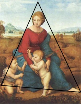
Source
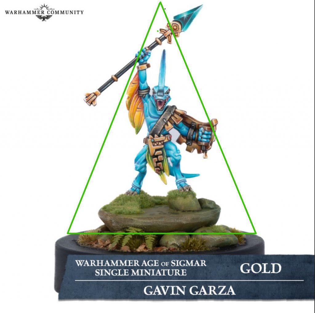
If we return to our image of the winning skink, we can start to explore some of the elements of the composition in this piece. The weapon held aloft in his right hand, while the left hand held to the side, slightly outstretched contributes to a strong triangular composition, as I’ve illustrated here in green. This helps to frame the figure, and give it some context, a place if you will. Further it helps to draw the eye around the model, ultimately leading to his face, a clear focal point.
Again, a lot of this composition is driven by the model itself. But in this case, its primarily the base that creates this strong composition – an addition created by the artist. The sculpt of the miniature finishes at his feet – the rocks he is standing on have been created independently, likely from scratch. Note how the base extends much wider on the horizontal plane, in affect widening the base of the triangle, reinforcing the overall composition.
Let’s take a look at Sigvald. Similarly to the skink, we can see that there is a triangular shape that starts to form (again, illustrated in green). Starting at the pillar at the left of the base and the protruding … thing (trophy? shrine? who knows what Slaanesh asks of her followers) at the right of the base, these two start to frame the figure and draw eye up towards the face and the top of the figure.
But then things start getting a little confusing – the position of the cloak and the outstretch sword start to form a strong almost horizontal plane running across the figure, which is conflicting with structure and composition that is created by other parts of the figure. It starts to introduce a second shape (illustrated in red) – which isn’t inherently bad, but it this case it conflicts with the first.
These conflicting compositional elements lead to the figure overall feeling unbalanced – the image and silhouette it presents isn’t in harmony; there’s no balance, so the end result is a less appealing.
One could argue that this is the result of the figure itself – and you’d be right. But the artist hasn’t done anything to either improve or expand upon the underlying composition in the same way that the artist behind the skink has (the base).
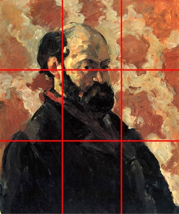
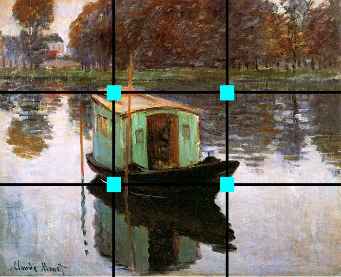
Let’s explore another great compositional technique and how / if this technique is used in each of the models. The rule of thirds is a fairly common compositional technique by which an image is divided into three equal horizontal planes and three equal vertical planes by overlaying (or visualising) vertical and horizontal lines. By using this technique, the artist can align elements within the image, such as the horizon, with these lines to create balance, or place subjects at or close to the intersections of these lines to create focal points. Using this compositional approach can help to balance the main subject with negative space around the subject that will draw the viewer’s eye. The Wiki article on the ‘rule of thirds’ states that “proponents of the technique claim that aligning a subject with these points creates more tension, energy and interest in the composition than simply centering the subject.
Its a technique most commonly associated with landscapes, and perhaps more so with photography rather than traditional painting.. If I’m honest, I’m not sure it can be applied to miniature painting and three dimensional works, but let’s see what we can discover. I’m taking a little creative liberty here and straying away from some of the tenets of the application of the rule of thirds – but I think its worth digging into.
Now I’m veering heavily into analysing the image of the miniature, rather than the miniature itself, which I’ll admit is a little misleading – we’re talking about an object that exists in three dimensional space, as opposed to a flat, two-dimensional representation of that object.
‘C’est une pipe’, etc.
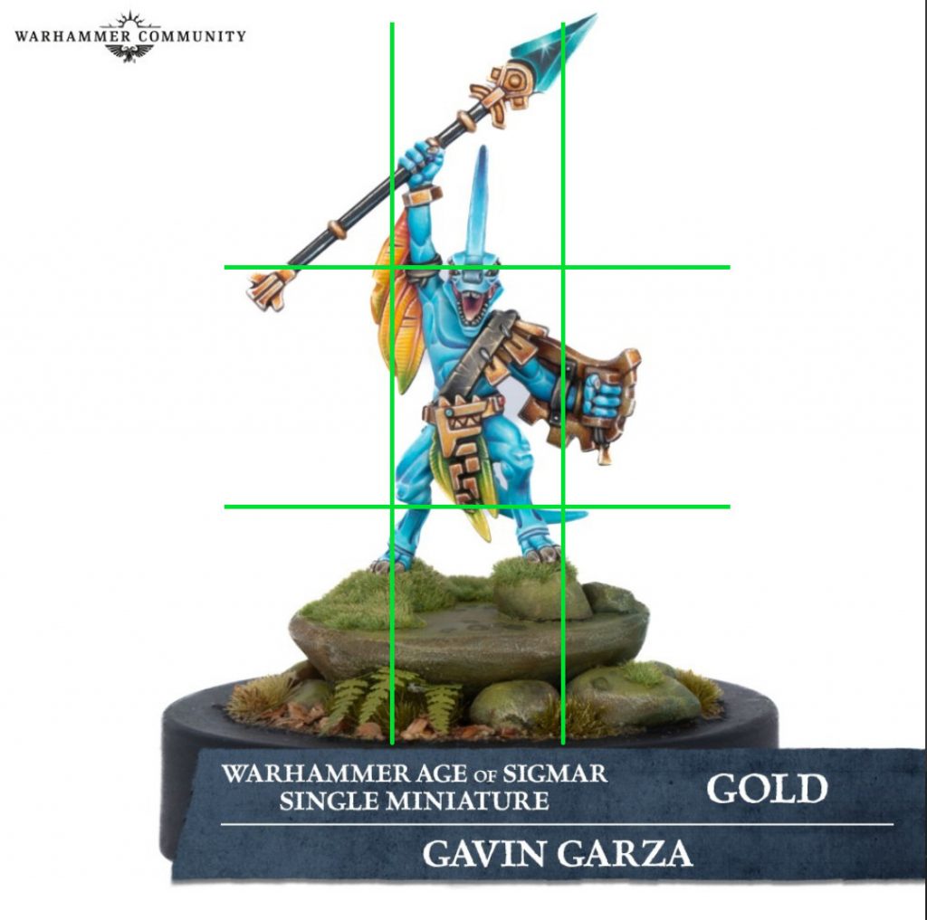
Jumping back to our little blue friend, I’ve taken the model (or the image of the model) and loosely overlaid a few lines to start to break up the overall composition with a ‘rule of thirds’ grid. Almost immediately we can start to see how the model maker has utilized this technique – either consciously or subconsciously – to create a much stronger overall composition than Sigvald.
Notice the position of the feathers attached to the skink’s right arm. There’s a few things happening here; firstly this is an area that exists right at the junction of those lines highlight with the ‘rule of thirds’. This naturally creates a strong focal point, which the artist has reinforced with the choice of colours used here. The combination of the yellows / oranges of the feathers and the blue of the skin work together – they’re complimentary colours (more on that later) and when taken in combination with their placement in the context of the overall composition, this presents a strong and engaging area of interest in the figure.
But they do more than just that – notice that the horizontal plane that focal point intersects with is almost directly aligned with the skinks’ eyes. Faces are a natural focal point for figure paintings and this figure is a strong example of how this can be reinforced to capture a viewer’s interest. The combination of the colours, their positioning and how the model has been placed on a taller base all combine to create an much more engaging composition that captures and keeps the eye’s attention.
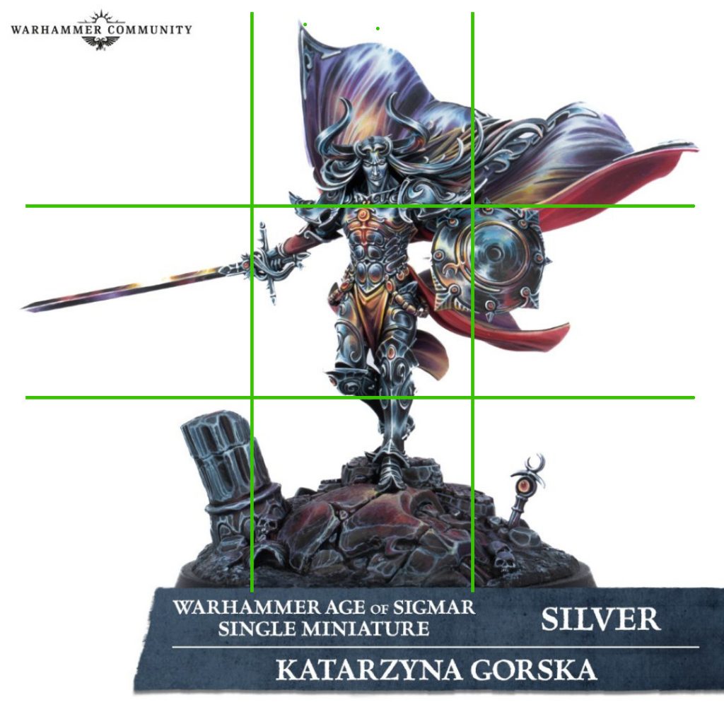
Let’s run through the same exercise with Sigvald, again applying a ‘rule of thirds’ grid over the figure. We can start to see that the overall composition isn’t as strong as the skink. At three of those intersection points there is no focal point – in fact, there is just negative space; ie, empty.. At the forth, just above the shield, although this is part of the positive space of the composition there is no clear focal point. The eye is lost in that area; there’s little definition, no contrast between the colours – there’s nothing to keep the viewers interest and a lot of the definition is lost in the paint work.
Further, consider the position of his face and head. What could (arguably, should) be a strong natural focal point of the figure is lost. The colour choice is a big part of this; there’s no strong contrast between the face and the surrounding hair and armour. Its busy, confusing. There’s a nice hint of colour just above his head, on the cloak behind it – and this is strong, but perhaps not quite strong enough. Overall the colours are a little muted and I don’t feel the contrast is strong enough to attract the eye’s attention. Additionally, having this colour behind the face, in the distance, distracts from the natural focus of the face. It confuses the viewer – we’re naturally drawn to faces, but here the cloak behind it conflicts with that natural tendency, drawing our attention to something in the background, away from the face.
If that same colour contrast (the orange / yellow hues) in the cloak were applied instead to the face, that would create a very strong focal point, allowing his face to stand out from the cloak in the background, rather than be overpowered by it.
Good composition is like a suspension bridge; each line adds strength and takes none away… Making lines run into each other is not composition. There must be motive for the connection. Get the art of controlling the observer – that is composition.
Robert Henri
Colour selection
Colour theory is … well, there’s a hell of a lot to it. Its something I have a loose understanding of, but admittedly don’t adhere to in my own work, at least not intentionally. At its simplest, colour theory describes the relationships between colours. Isaac Newtown first developed the colour wheel in 1666 as a way to illustrate the relationship between colours. By using the colour wheel, we can start to explore certain combinations of colour, and colour harmony. Colour harmony refers to aesthetically pleasing and harmonious colour combinations based on their geometric relationships on the colour wheel.
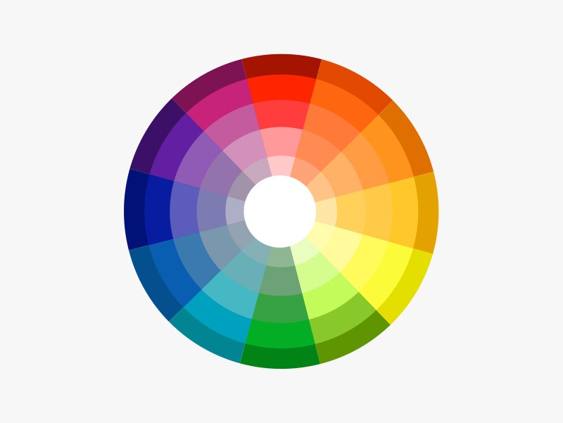
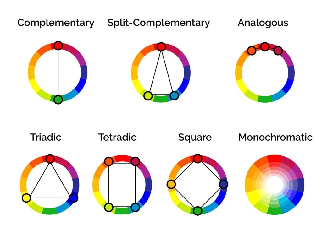
There are several different colour harmonies that are used throughout all forms of art and design. I won’t go into details on them all, but one of the most common harmonies is ‘complementary’. Complementary colours are those that sit opposite each other on the colour wheel. These combinations create vibrant colour palettes with high contrast and ideal for creating strong focal points in an image. Areas that stand out and draw the viewer’s eye and capture its attention often leverage complementary colours.
However, its quite that straightforward. Used equally, two complimentary colours can end up competing with each other for visual attention and end up looking discordant. One approach to minimize this is to consider colour dominance; letting one colour occupy a larger area of the model and using its complimentary colour for smaller areas. This helps to create a balance between the colour’s strengths and result in a much more eye pleasing overall result.
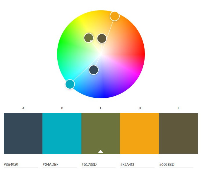
Let’s look at Sigveld first. Below you’ll see two images. The first (top) I’ve extracted some of the key colours out using a colour picker and generated a loose colour palette. Certainly there are more colours than just those 5, but these are perhaps the most dominant or commonly used and help us to form an overall sense of the colours used in the piece.
In this second image (bottom), I’ve taken those colours and plotted them on a colour wheel. By doing so, we can start to see what relationships exist between the colours. We can also start to understand their saturation. The closer the colour is to the centre of the wheel, the less saturated it is. Less saturated colours appear duller, more muted, whereas highly saturated colours are generally brighter, more vibrant.
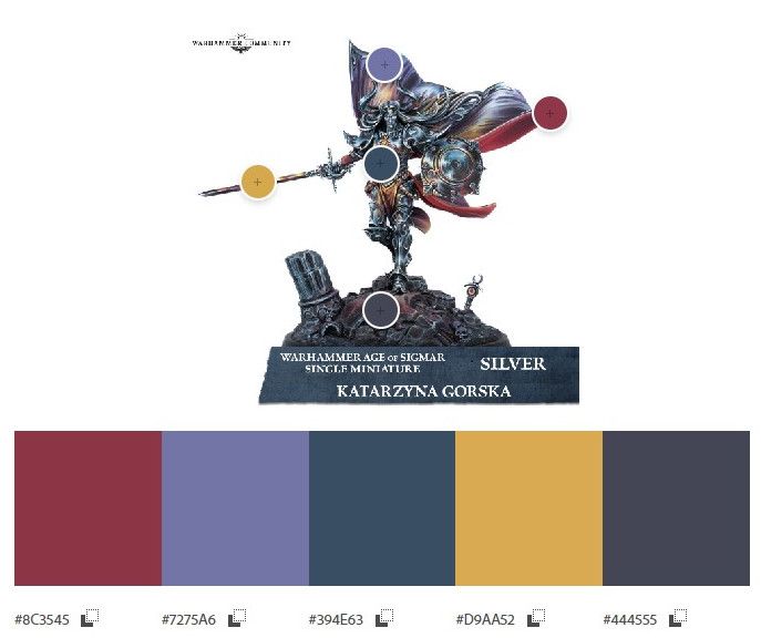
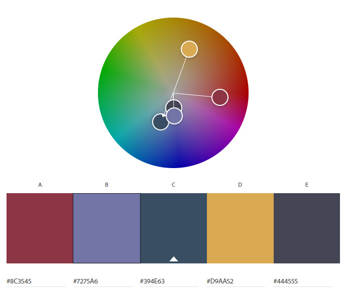
With Sigveld’s palette defined, we can start to see a rough approximation of the colours used. Again, this is just a snapshot – it certainly isn’t all colours used, nor does it aim to be. We’re just trying to draw out some of the more common colours. Immediately we can see similarities – the colour from the base is quite similar to the colour of the armour, and they’re all quite muted
Looking at these colours on the colour wheel, we can immediately see that three of the five colours are from approximately the same area. Together they almost start to form an analogues relationship, but they’re all too similar to form a strong harmony. These three colours are arguably the most dominant in the piece, and being so similar they start to blend together and get lost.
If we look opposite the colour wheel, we have the brighter yellow colour. This suggests a strong complimentary relationship to with the purple / grey colours, which is the start of something. However look at their placement on the model. The yellow is only really used on the sword (and some spot colours on the cloak above his head). There simply isn’t enough of this colour to reinforce that relationship; its lost, overpowered and drowned out by the other tones.
Perhaps more importantly is the saturation values of these colours. They’re all sitting close to the centre of the wheel, meaning there’s lower saturation. On its own, this isn’t a problem. But it needs to be counterbalanced with some colours sitting higher in saturation value, in order to create a strong overall image Without that contrast and counterbalance, the overall look is dull, muted. Details get lost, there’s no clear focal points to capture the eye.
And that’s exactly what is happening with this piece. Sure, the techniques used are amazing, but they’re lost in an average selection of colours. With just one or two more highly saturated colours, used in different parts of the model to contrast the muted greys / blue / purple tones and create strong focal points I think the overall impact of this piece would be much more powerful.
Digging deeper into the colour selection used on the skink and the magic starts to happen. This is the area where I feel the skink is definately the stronger piece of the two and deserving of the win.
Firstly, the bright blue of the skin, which is clearly the dominant colour. Its bright, vibrant and has a very strong saturation value. This immediately makes it catch the eye. Looking across the colour wheel and we see the yellow / oranges of the feathers attached to his right arm. Here we have a great example of a complimentary relationship. The colours sit close to directly opposite other, helping to generate contrast.
But perhaps more importantly, is the amount of each colour used. The light blue is clearly dominant, making up the majority of the figure, whereas the yellow is used sparingly. The relationship between the two colours makes the yellow stand out, but this is offset by the amount of each colour – it creates a strong balance between the colour’s strengths.
But wait – there’s more. Looks at the colours extracted from the base, most notably the green. Yes, its quite a muted green – but that’s a good thing. It doesn’t overpower the rest of the model. But something else is at play – look at the position of that colour on the wheel in relation to the light blue and yellow. It’s close to right between the two.
When colours are mixed, you’ll end up with a colour that is between those original two colours on the colour wheel. Blue and yellow are two of the three primary colours (the other being red). Now if you mix blue and yellow, you create a secondary colour; green – the main colour in the base of the model. This is the secret sauce in the skink’s colour scheme – that green serves to tie the other prominent colours together, rounding off a wonderful palette of colours across the whole model. All these colours work together to create a harmonious overall image, reinforcing focal points established by the structure and composition.

Colour helps to express light—not the physical phenomenon, but the only light that really exists, that in the artist’s brain..
Henri Matisse
Original sin
Something else that I think was worth exploring was a brief look at just how different each model is from its original and how the paint jobs differ from the ‘Eavy Metal images used by Games Workshop to advertise their respective models. I suspect this probably played a part in both the judges final decision and why the Skink may be percieved as being the inferior entry.
Its important to keep in mind that in this (and any other Golden Demon) competition, the judges would have been looking at thousands of models. In this context any additional effort that the painters have made to try and stand out from the crowd would likely have been looked upon favourably, so this may have contributed to their final decision. More so, I think its important to consider what the painter has added to the model beyond just a good paint job.
These figures are no doubt judged on a very wide criteria; the overall quality and technical ability of the painter is likely only one aspect of this. Its important to consider what else they’ve introduced; how it complements and reinforces the model and how they’ve made their entry unique.
Here’s the skink – first image is the GW image, likely painted by a GW staff member and used for promotional material, box art etc. Second image is the Slayer sword winning entry.
Immediately you’ll see that, well, there isn’t much difference. The winning entry is close to identical to the GW model. The colours are much the same, the model itself hasn’t really been customized. I think this where some of the disbelief in its victory comes from, and its hard to disagree. Sure, its a great model – but, it looks just like all the other skinks.
The base, however, is where it shines. Its subtle, but absolutely a custom job, and very well done. Notice again how the widening of the base reinforces the structure and composition of the model.
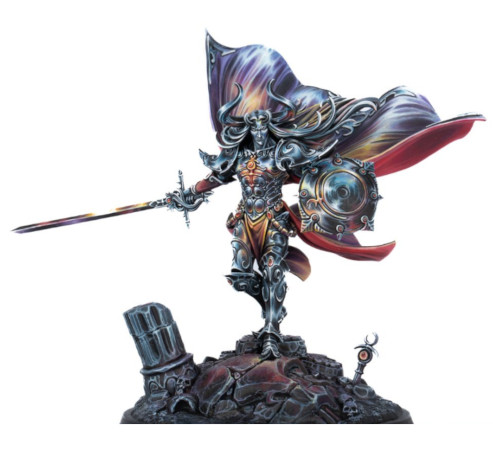
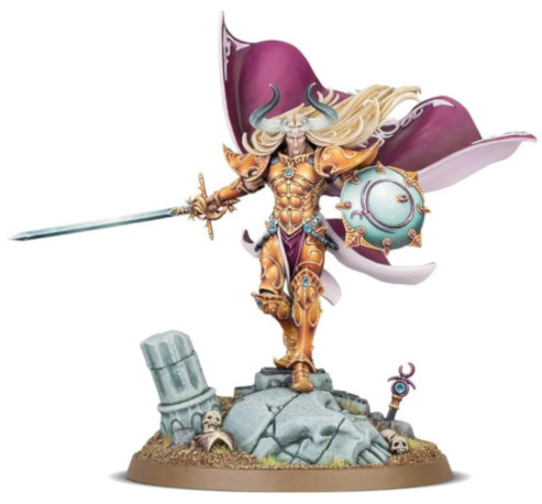
Taking a look at Sigvald now – with the exception of the paintjob, the model is entirely in its ‘original’ state. Even the base is completely unmodified (with the exception of the display plinth). In that sense, it’s the same Sigvald we’ve all seen before.
Or is it? Compare the paint job itself. The silver winning entry is entirely in a league of its own, such a departure from the ‘standard’ Games Workshop theme and is deserving of very high praise. Yes, I have issues with some of the colour choices, but this interpretation of the model is truly unique – the artist really has put their own interpretation on it; and I think this is worthy of much more praise than it gets.
There’s no doubt that both figures are stunning. The technical aspects – blending, glazing, details etc are all immaculate on both models. So what differentiates one from the other? What makes one ‘better’? Let’s go beyond the paint for minute.
Musical Interlude
All this talk of lines and composition reminds me of this gem – sing it with me:
“Who is responsible, when the line is stretched? Who is responsible, when it becomes a triangle?”