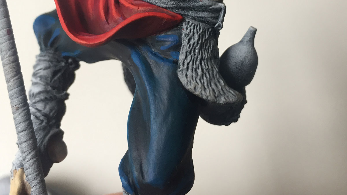
I had a little bit of momentum built up from my first session with Monkey, and was able to capitalize on it. I’d decided to get cracking on his pants. However, this led to a crippling moment of indecision. I couldn’t for the life of me settle on a colour. My wife and I have a silly little game we play that I’ve dubbed – somewhat obviously – ‘Opinion Time.’ This game consists of me showing her the part of a model I’m about to begin work on, and asking her which of 2-3 colour schemes I should go with. 9 times out of 10, she offers her opinion and I chose the opposite. I’m stubborn like that. But, she’s very creative herself and has a great sense of colour, so I value her opinion.
We debated and deliberated at length, my indecisiveness become more and more tangible. I wanted to go with a darker, somewhat muted blue, but somehow instinctively I knew this wasn’t the right call. Traditionally, my style of painting, and indeed other areas of life, fashion, taste in art and décor etc. leans toward bold, bright contrasting colours. I knew I was was falling back onto this, which isn’t inherently a problem, but I was playing it safe. Additionally, blue is another colour I’m comfortable working with. The alternative was a tan / brown colour, but I was concerned it would limit my options when it comes to his skin and fur and would end up with a see of brown and beige in the figure as a whole.
Blue has no dimensions, it is beyond dimensions, whereas the other colours are no. All colours arouse specific associative ideas, psychologically material or tangible, while blue suggests at most the sea and sky, and they, after all, are in actual, visible nature what is most abstract.
Yves klein
Laying down the blues
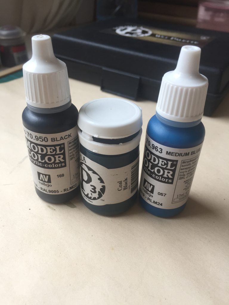
Following much the same process as previously, working the blues was fairly straight forward. I was mindful of keeping the value fairly dark; I didn’t want to end up with an overly bright finish, and knowing my habits, this was a real risk.
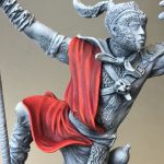
This whole step was completed fairly quickly. Taking a step back, and especially the next day, I wasn’t happy. I can’t quite put my finger on why exactly; the blends, shadows and highlights are good enough. But I’m just now happy with the overall look. I think there’s just too much ‘primary’ colour going on, and the bright red of his tunic just aren’t working with blue of his pants.
Additionally, I plan on doing his scarf yellow, so looking ahead to that, I’m worried the final result will be overpowering with all those bright, strongly contrasting colours.
I desperately want to re-do his pants. But I know that doing so now will lead to irrational decisions, and a rushed job. I’ll hold off for now. Once I get some of the other colours down, his flesh, fur and maybe some of the other details like his armour, I’ll have a better idea of which colours are going to work.
I’m trying to let mistakes happen, but somehow this one is really getting to me. Its not even that the result is that bad, nor is him having blue pants unreasonable, nor unfitting of the character. It just doesn’t fit the image in my head, so its really killing my motivation.
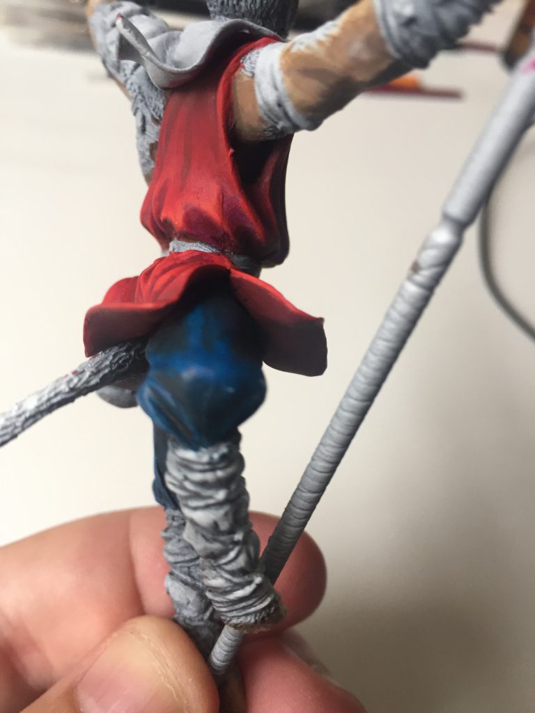
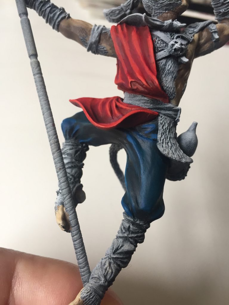
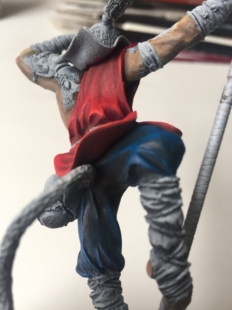
Capitalizing on momentum, laying the foundations of the flesh and skin – resulting in disaster
As you’ll see in the above images, I took hold of the momentum I had and lept into painting Monkey’s flesh. Painting skin tones is hard; really hard. I avoid it where possible; I’ll opt for figures encased in armor and helmets, or stick with alien races.
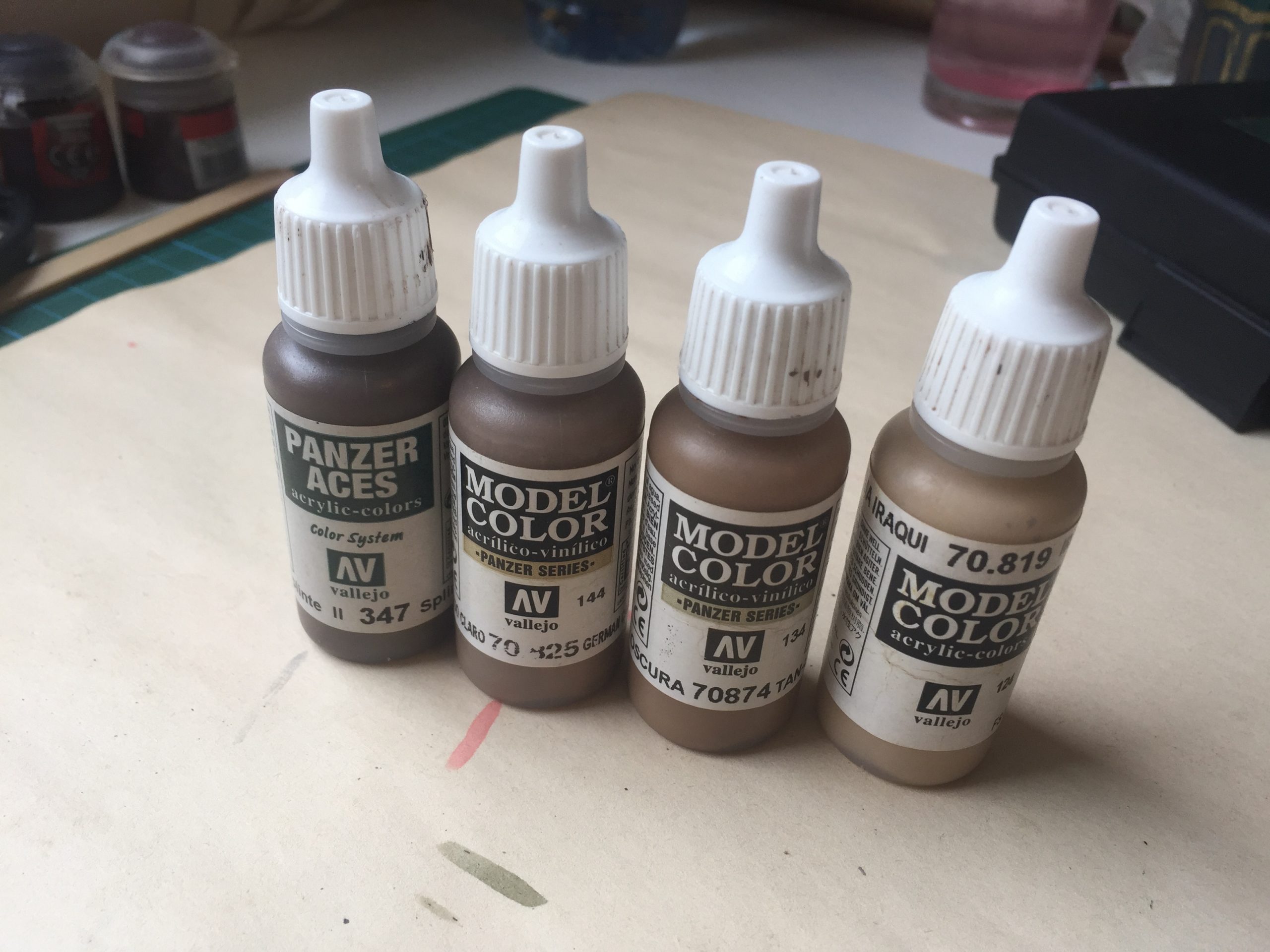
I was scared of this step, and wary of how to proceed. I didn’t want to go with a traditional human like flesh tone; I wanted something a little more animalistic.
I opted for a range of brown’s and tans, loaded up the wet palette and went to work, again trying to use the zenithal highlights to guide the light and shadow.
Then I sort of… gave up. It wasn’t working, my colour choices weren’t quite right, I was stupid tired, and wasn’t really trying. I was just going through the motions, it was sloppy and I kind of didn’t care. Sometimes that can be useful; if you can channel it. In this case, not so much.
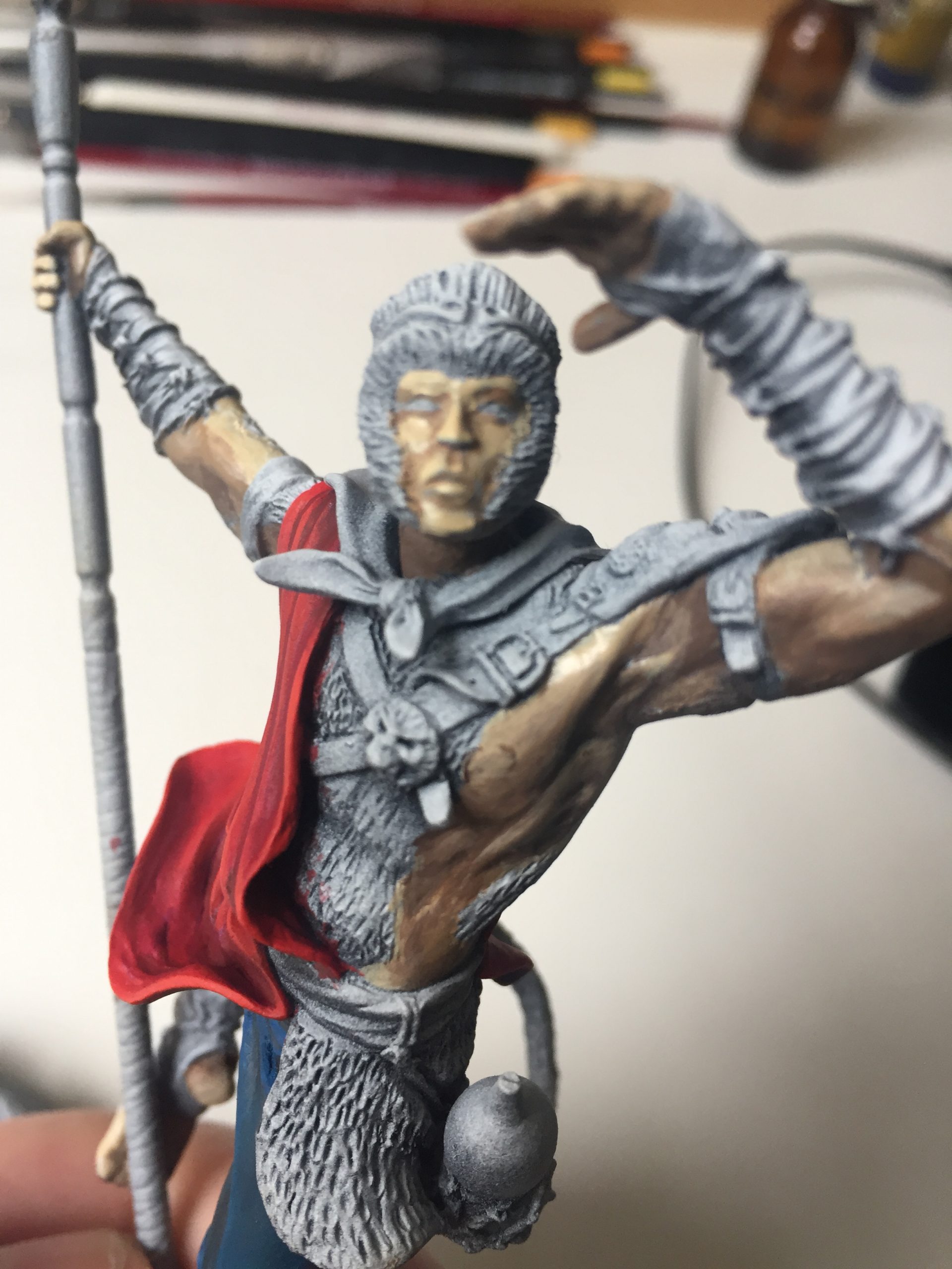
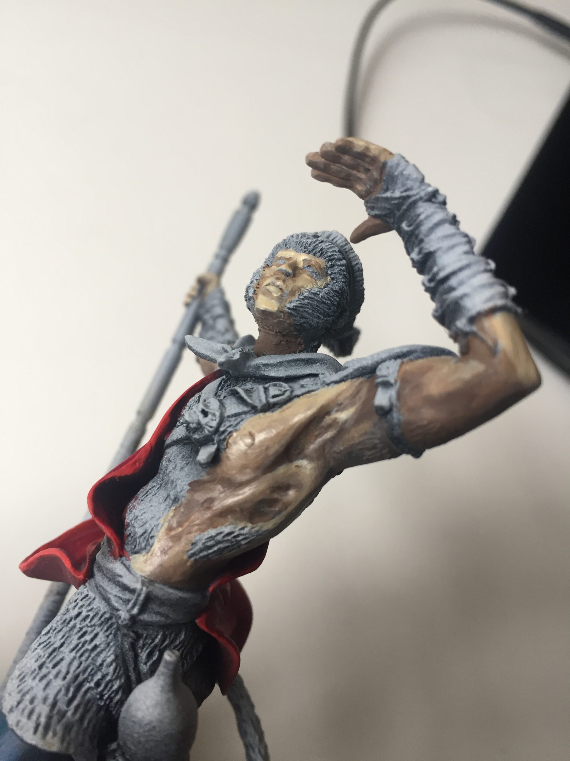
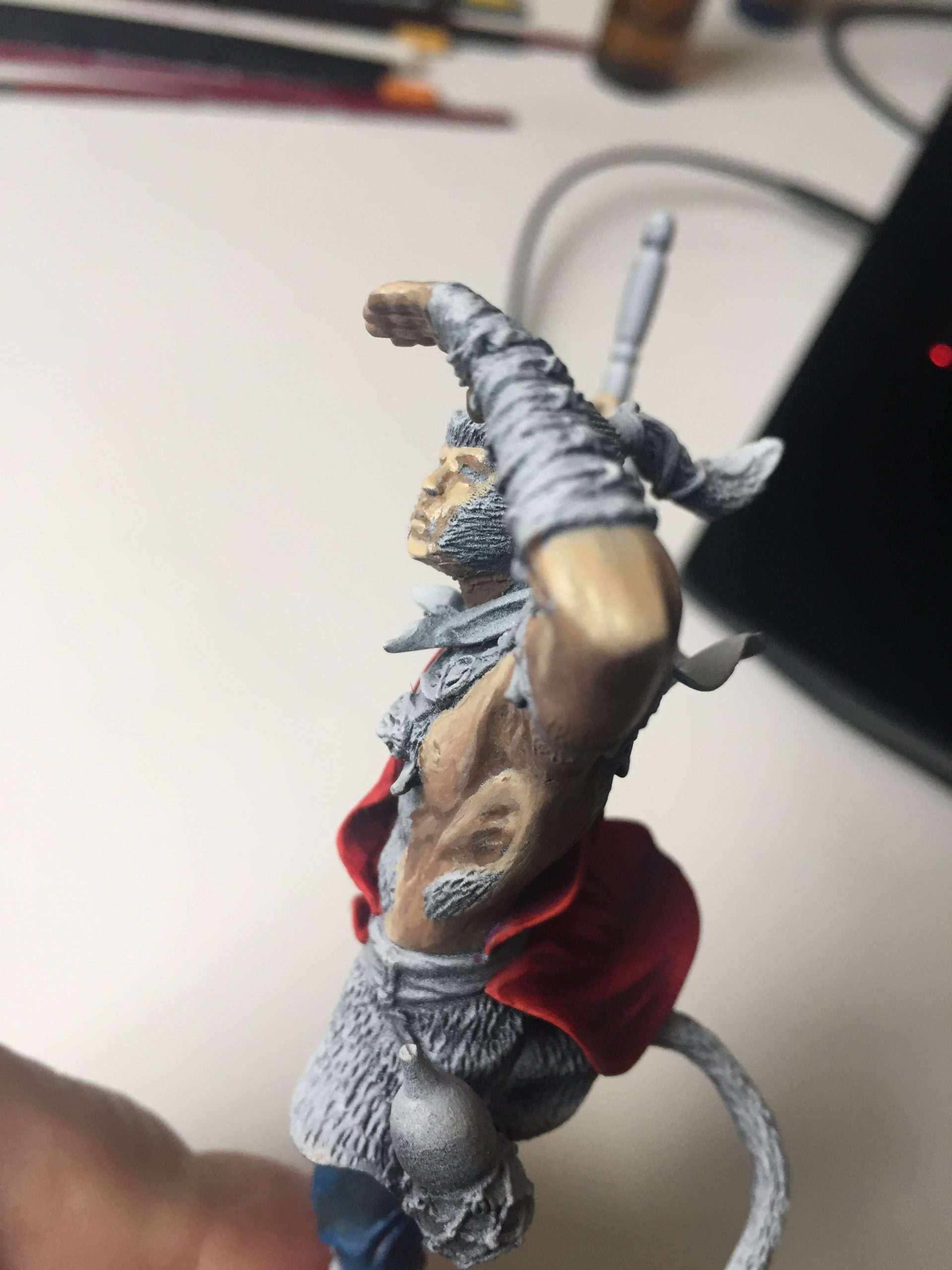
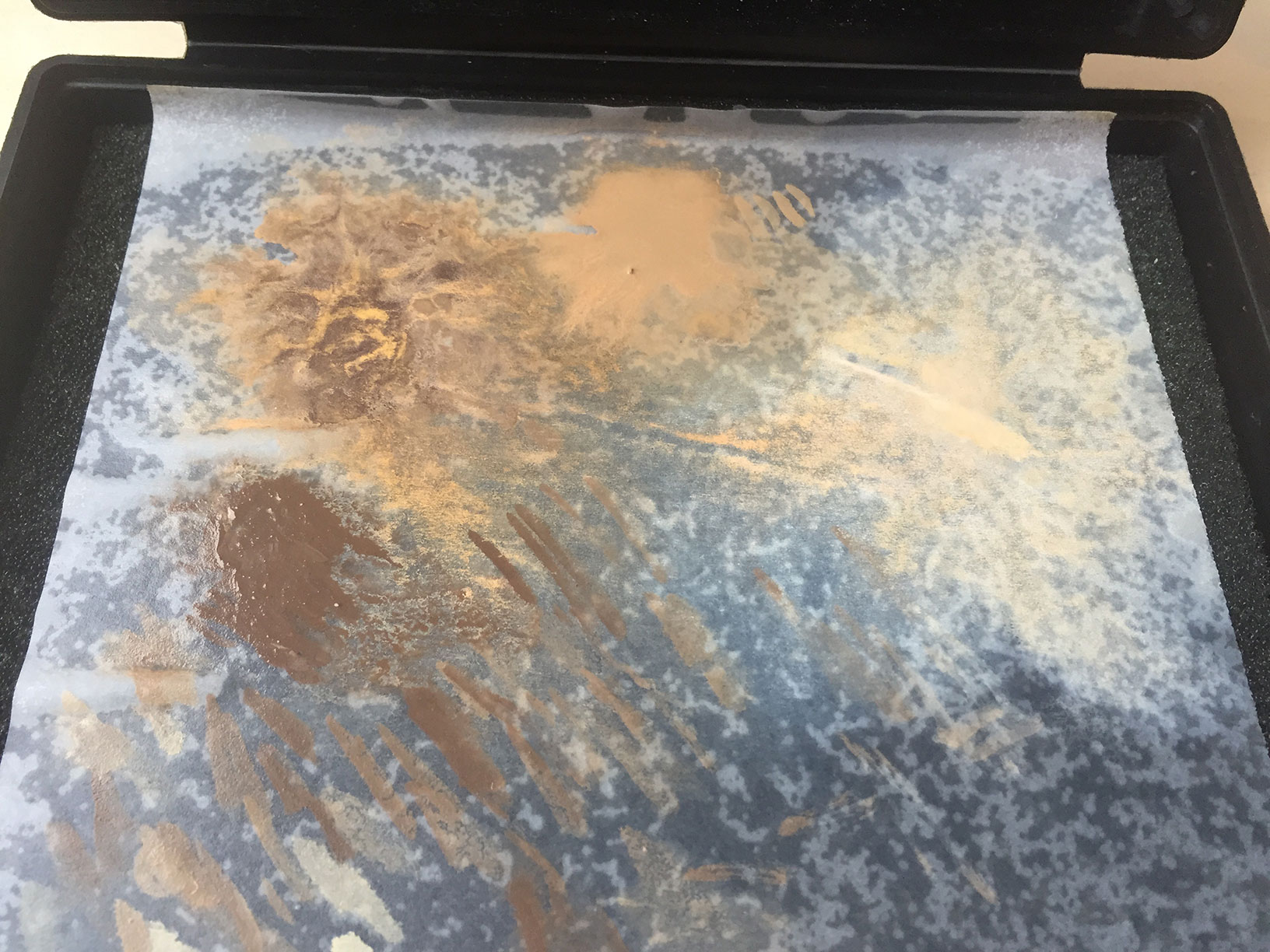
I called it quits; it was late, I had to stop and come back with a fresh set of eyes. I’m kind of horrified by the results if I’m honest. Everything about it leaves me disappointed; the blending isn’t there, the shadows aren’t right. Just …. nothing.
It should be salvageable though. I’m not sure how, but despite hating where things are at, I think I can pull it back. Its not a ‘strip and prime again’ situation, which does give me some hope. Motivation and focus is still an issue though. I said yesterday that I’d spend the rest of the day painting. I did everything but paint. I think I need to establish some sort routine; a regular pattern of painting days and times so I can built the behaviours.
Today I’m listening to a lot of Smashing Pumpkins. My dearest Grandma gave me a copy of “Melancholy and the Infinite Sadness” for Christmas the year it was release. I never really appreciated it, nor the band back then. I was wrong, they’re pretty amazing. I’m not wrong about Pearl Jam though. They’re garbage. Always have been, always will be.
More Monkey…
- The ashes before the phoenix rises
 Monkey King Part 4
- Lessons learned the hard way
 Monkey King Part 3
- Simply Red.
 Monkey King Part 2
- Born from an egg on a mountain top
 Monkey King Part 1